Spacing
We use spacing tokens to make margins and patterns consistently across components and layouts. Using a set spacing scale helps eliminate guesswork regarding the space between elements, and helps create a smooth, readable flow from page to page.
Best Practices
Human beings are pattern seekers. An important part of how we perceive our environments is by grouping together things that appear related, as a way to reduce our cognitive load. Here are a few key guidelines to consider when using spacing:
Optimize for pattern recognition.
Pay attention to the proximity between items. Use small spacing between elements that belong together; use medium or large spacing to distinguish an item from the rest of the group.
Use backgrounds thoughtfully.
Putting a background behind a set of items helps to create a figure/ground relationship that can make it easier to scan a page. Too many backgrounds, however, makes it harder to scan the information. Use large or xlarge spacing at the edge of backgrounds to help contain the different chunks of information.
Scale
Use the Spacing Scale when creating individual elements, or doing page layouts in Sketch. Our spacing scale is already applied to and used within all Bolt components.
Name (use **bolt-spacing(NAME)** to apply class) |
rem | px | Example |
|---|---|---|---|
| xxsmall | .25 | 4 |  |
| xsmall | .5 | 8 |  |
| small | 1 | 16 |  |
| medium | 2 | 32 |  |
| large | 4 | 64 |  |
| xlarge | 8 | 128 |  |
| xxlarge | 16 | 256 |  |
Examples
Here are a few representative examples of how to use spacing in your layouts.
Card with teaser

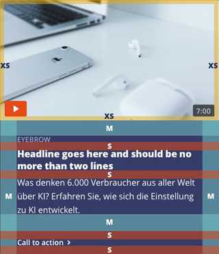
In a teaser card, use small spacing to separate text elements from one another. medium spacing provides breathing room around the main content components.
Hero bands

In a hero/feature band, use medium spacing to create visual distinction between elements in each section, and incorporate xlarge spacing around the sections to help provide breathing room for the image.
Multi-card bands

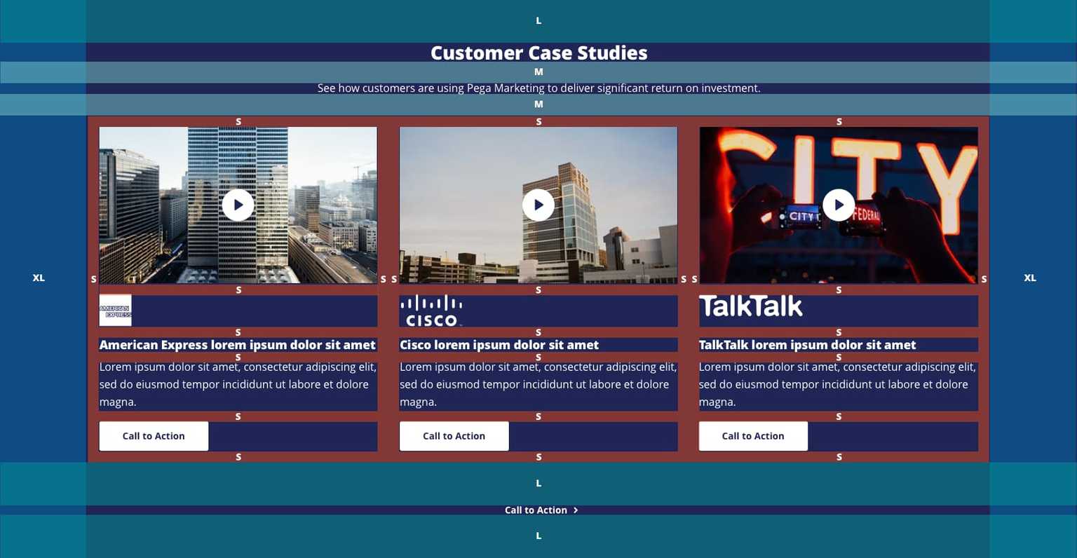
When using a band to hold multiple things, including headlines, cards and other elements, be judicious with spacing around each element to ensure that the eye can move through the section easily.