Typography
Effective typography helps to create visual balance on a page—essential for long-format text and marketing copy. By staying consistent with fonts, sizing and spacing, we can create variety in our layouts while still maintaining a sense of context and consistency.
Best Practices
Pega uses Open Sans as the foundation type family for all Digital products. Its simple, legible structure helps optimize for readability across the web, and a variety of weights and characters helps provide visual interest while speaking to a global audience. Here are some additional guidelines:
Create a clear typographical hierarchy
Optimize for content that is easy to scan. Use headings as the primary visual focus, and keep body copy at a consistent size. When writing, consider how bulleted lists can be used to break up long passages of text.
Use Extra-Bold only for headlines
For headlines, we use Open Sans Extra-Bold to optimize contrast between the heading and the content below. Only use Extra-Bold for headlines; avoid using it for body copy or other written content.
Use Bold selectively to add emphasis
Overuse of Bold fonts makes it difficult to scan text and find the most important information. Restrict the use of Bold to key information, such as an element name in documentation or a product name in marketing copy.
Base Sizes
Typography in Bolt is fluid, with a base 15px font for smallest screens (320px min) with a max of 18px on the largest screens, e.g. 36” displays. The space between paragraph breaks is equal to the line height. Type sizes consistently scale based on their rem value across all screen sizes except for XXXL, which starts at 2.28rem on the smallest screens, up to 3.08rem. XXXL also includes a fallback to 1.781rem after the headline reaches 180 characters.
Headlines
For all headline options and API docs, see the headline reference in Pattern Lab.
Bolt uses a double-stranded heading hierarchy which abstracts the HTML document hierarchy (h1, h2, etc.) from the visual hierarchy of the layout. This layer of abstraction is important to maintaining the document outline of a page for tools like screen readers. Each type style has an assigned CSS classname. These classes are independent of location or type of element.
| Description/Example | Weight | Size (rem) | Line (rem) |
|---|---|---|---|
| XXXL Heading (drops to XXL after 120 characters) | 800 | 3.083 | 1.14 |
| XXL Heading | 800 | 1.781 | 1.13 |
| XL Heading | 800 | 1.417 | 1.45 |
| L Heading | 800 | 1.111 | 1.31 |
| S Heading (transforms to uppercase) | 800 | .9 | 1.51 |
Body copy and subheads
Subheads and body copy are displayed at Regular weight. For body copy, we default to 15px on small screens and 16px on medium to large screens. A generous line-height optimizes legibility, crucial for reading long-form text on the web.
| Description/Example | Weight | Size (rem) | Line (rem) |
|---|---|---|---|
| XXL subhead (only use with XXL heading or above) | 400 | 1.781 | 1.13 |
| XL subhead (only use with XL heading) | 400 | 1.417 | 1.45 |
| Eyebrow (transforms to uppercase; includes 70% transparency) | 400 | .8 | 1.45 |
| Medium (default) body | 400 | 1 | 1.65 |
| XS | 400 | .8 | 1.45 |
Examples
Teasers
For a full reference of teaser variations along with API docs, visit the teaser reference in Pattern Lab.
A teaser is most commonly used in cards and bands. It contains an eyebrow, heading, and a paragraph. In some cases, it will also include an optional subheading.

- 1.0 Eyebrow
- 1.1 XXL Heading
- 1.2 XL Subheading
- 1.3 Medium body
Articles/long form content
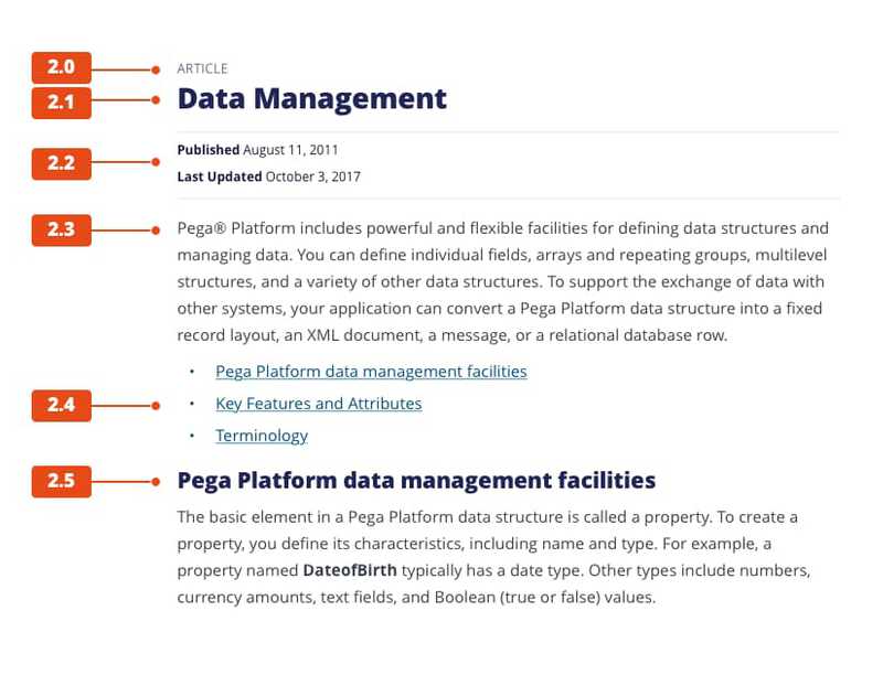
For long form content, page titles always use the XXL Heading. From there, h2 tags and below are sized appropriately to create a strong hierarchy.

- 2.0 Eyebrow
- 2.1 XXL Heading
- 2.2 XS
- 2.3 Medium body
- 2.4 Unordered list w/links
- 2.5 XL Heading
Unordered lists
Unordered lists are styled with standard bullets, and are optimized for all color themes. For all options and API docs, see the unordered list reference in Pattern Lab.

Ordered Lists
Ordered lists are also optimized for all color themes. For all options and API docs, see the ordered list reference in Pattern Lab.
